On this page
- What is the Heiken Ashi candle? How is Heiken Ashi worked out?
- How to turn the Heiken Ashi chart on and off in TradingView and in the MT4 platform
- What the Heiken Ashi candle is like, compared with the Japanese candle
- What the Heiken Ashi chart is used for in trading
- What the Heiken Ashi chart is good and bad at
- In closing
When you speak of the great contributions to technical analysis in the forex market in particular, and in financial markets in general, you cannot leave out what the Japanese have contributed. 2 of their most important and most widely used contributions are the Japanese candlestick chart and the Ichimoku system. Those are achievements nobody can deny, and the Japanese candlestick chart in particular is the most common form of price chart among investors and traders around the world.
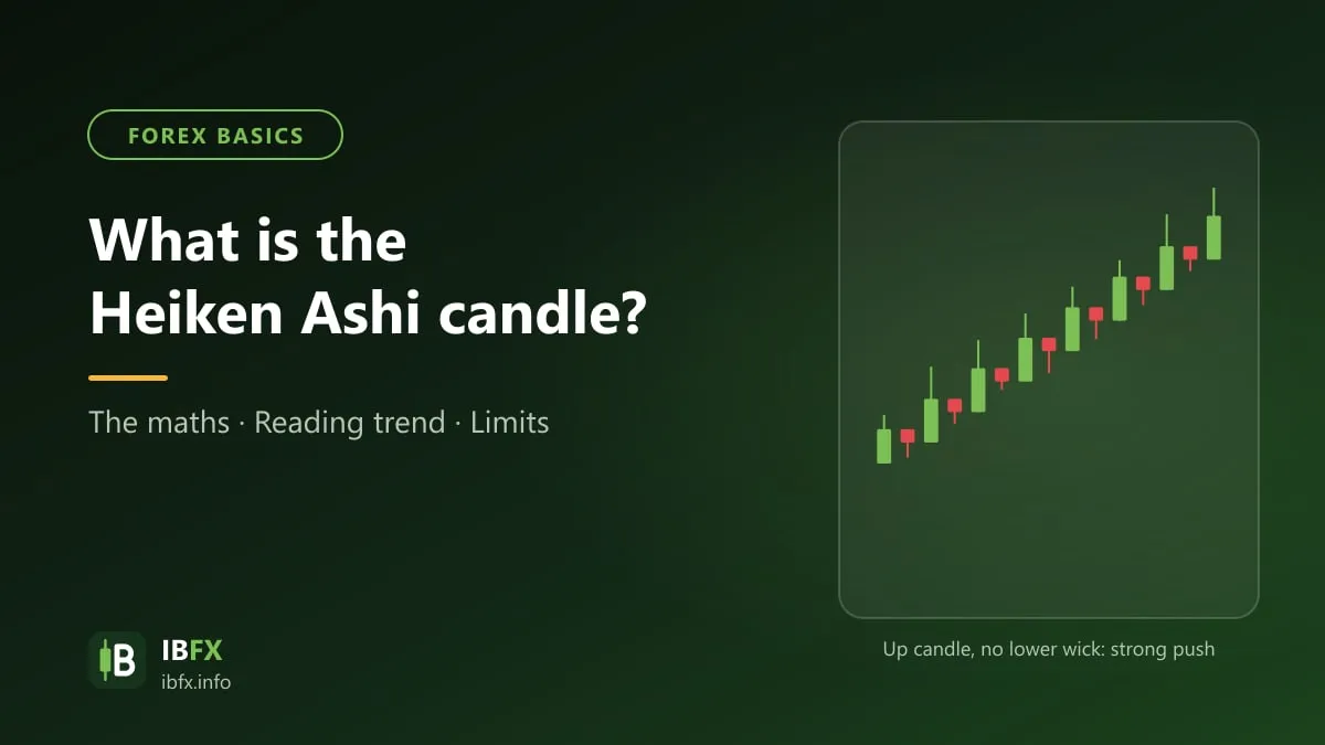
Alongside the Japanese candlestick, the Japanese also developed another kind of candle, called Heiken Ashi, although Heiken Ashi counts as an indicator rather than a type of price chart. What Heiken Ashi has over the ordinary Japanese candle is that it makes the trend easier to see, and in exchange its signal comes later.
So what does the Heiken Ashi candle look like, how does it differ from the Japanese candle, and how do you use it to work out the trend? We will go through Heiken Ashi together in this article.
What is the Heiken Ashi candle? How is Heiken Ashi worked out?
The Heiken Ashi candle (also written Heikin-Ashi) is a variant of the Japanese candle. Plenty of sources tie it to Munehisa Homma, the rice merchant treated as the father of the Japanese candle in the 18th century, though there is no clear evidence for that; the technique became common in the West after Dan Valcu’s article in 2004. Heiken Ashi in Japanese means “average bar” or “average candle”, because its price levels are worked out from averages.
Just like an ordinary Japanese candle, Heiken Ashi looks much the same: a body and 2 wicks. Heiken Ashi also has 4 price levels: the High, the Low, the Open and the Close, although the formulas that produce them are a good deal more involved.
Where the High, Low, Open and Close of an ordinary Japanese candle come from the prices of the very session that formed the candle, those 4 levels in a Heiken Ashi candle also depend on the prices of the session right before it.
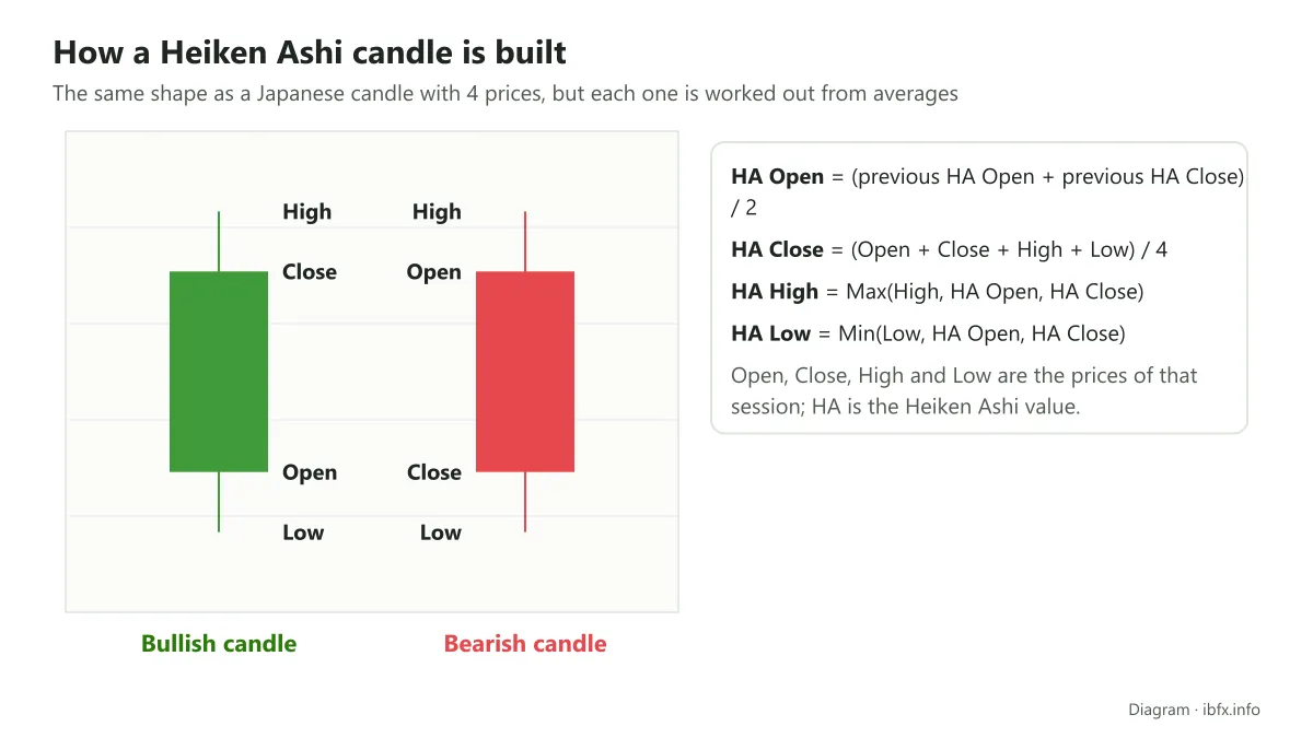
- The formulas for the price levels of a Heiken Ashi candle
The open is the average of the open and the close of the previous Heiken Ashi candle (not of the ordinary Japanese candle).
HA Open = (HA Open of the previous candle + HA Close of the previous candle)/2
The close is the average of 4 prices: the open, the close, the high and the low of the current session itself.
HA Close = (Open + Close + High + Low)/4
The high is the largest of these 3 prices: the high of the current session, the Heiken Ashi open and the Heiken Ashi close of that same candle.
HA High = Max (High, HA Open, HA Close)
The low is the smallest of these 3 prices: the low of the current session, the Heiken Ashi open and the Heiken Ashi close of that same candle.
HA Low = Min (Low, HA Open, HA Close)
How to turn the Heiken Ashi chart on and off in TradingView and in the MT4 platform
Turning Heiken Ashi on and off in TradingView
It is very simple. Once you have any price chart open, click the icon shaped like candles on the toolbar (as below), then choose Heikin Ashi.
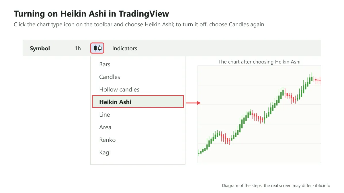
To turn Heiken Ashi off you do the same thing and choose Candles.
Turning Heiken Ashi on in the MT4 platform
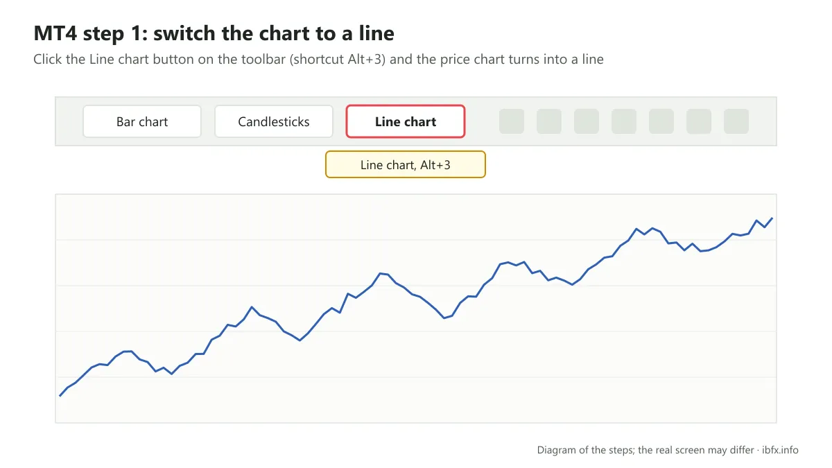
Step 1: on the toolbar, click the Line chart icon, and the price chart switches to a line, as in the picture below:
Step 2: right-click on the price chart and choose Properties…
The chart settings dialog opens, as below:
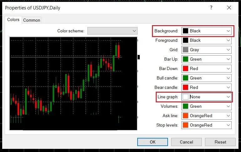
Here, pay attention to 2 entries: Background and Line graph. In the Line graph box, choose None.
By default the Heiken Ashi chart comes in red (falling candles) and white (rising candles), and if you leave those defaults as they are, choose black for Background so it is easier to read. If you would rather turn the rising candles green, as on an ordinary Japanese candle, you can switch the background to white, which makes the screen feel brighter; if not, black works just as well.
Step 3: on the toolbar, add Heiken Ashi through this path: Indicators 🡪 Custom 🡪 Heiken Ashi.
The indicator dialog opens, and you press OK to finish.
Heiken Ashi on the chart will look like this:
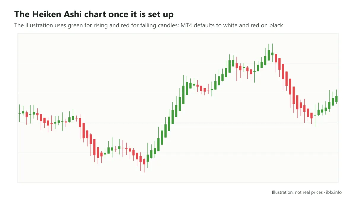
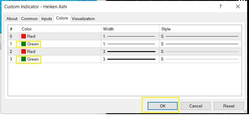
If you want to turn the rising candles green, right-click any candle on the chart and choose Heiken Ashi properties…
The indicator dialog opens; go to the Colors tab, pick the color for the rising candle again, then press OK to finish.
To turn Heiken Ashi off and go back to the Japanese candlestick chart, first right-click any Heiken Ashi candle on the chart, then choose Delete Indicator. After that, on the toolbar, click the Candlestick chart icon again, next to the Line chart button from step 1, and you are done.
What the Heiken Ashi candle is like, compared with the Japanese candle
To compare the Heiken Ashi chart with the Japanese candlestick chart, look at the picture below: EUR/USD on the D1 timeframe, over the same period.
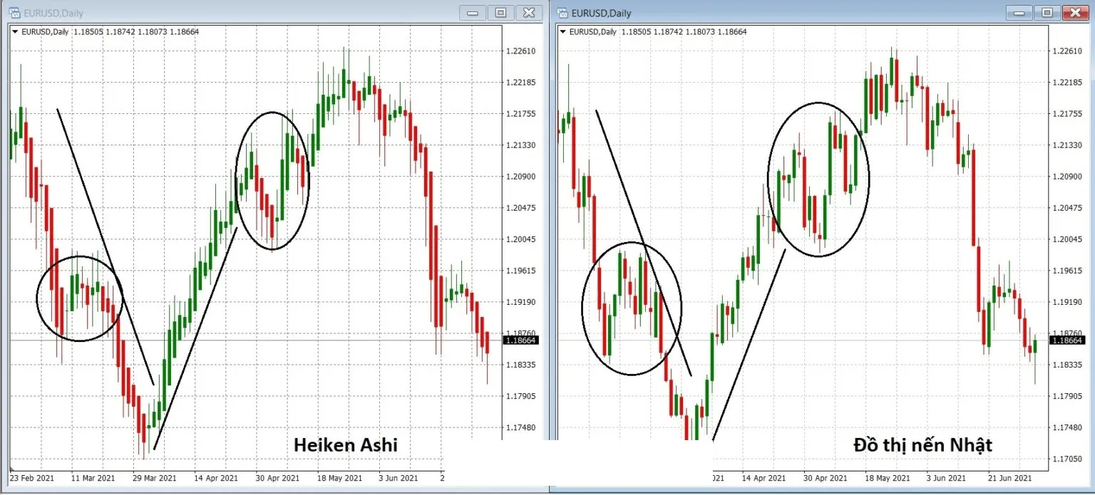
The screenshot shows the Vietnamese interface; the buttons and labels sit in the same places in the English version.
The first difference between Heiken Ashi and the Japanese candlestick chart is that the Heiken Ashi chart looks quite full, seemingly denser and more tightly packed. The reason is that on an ordinary Japanese candlestick chart the open of the next session equals the close of the session before (except where a GAP appears), so the candles follow each other tail to head, whereas on a Heiken Ashi chart the candle behind starts from around the middle of the body of the candle in front, so a Heiken Ashi chart never shows a GAP. This feature alone lets you tell an ordinary Japanese candlestick chart from a Heiken Ashi one.
Next, the direction of the move is much the same on both, but the Heiken Ashi chart is smoother than the Japanese candlestick chart, particularly at the places circled in the picture. This difference exists because of the averaging in the formulas, which makes Heiken Ashi smoother, much like a moving average (MA). It is thanks to this smoothness that the Heiken Ashi chart takes out a fair number of noisy signals.
Third, over the 2 stretches of downtrend and uptrend marked in the picture, on the Heiken Ashi chart the downtrend is made almost entirely of red candles and the uptrend only of green candles. On the ordinary Japanese candlestick chart, meanwhile, the downtrend still has green candles mixed in and the uptrend still has a good many red ones. This is what makes the Heiken Ashi chart show the trend of the market more plainly than the Japanese candlestick chart does.
Fourth, even though the current market price on both is 1.18664, drawn on the chart, with Heiken Ashi the movement of the candle does not show the current price of the market, and it is not the price your order would fill at. That is exactly why the Heiken Ashi chart is an indicator and not a price chart. That is the reason Heiken Ashi sits under Indicators rather than among the price chart types such as Japanese candles, bars or lines.
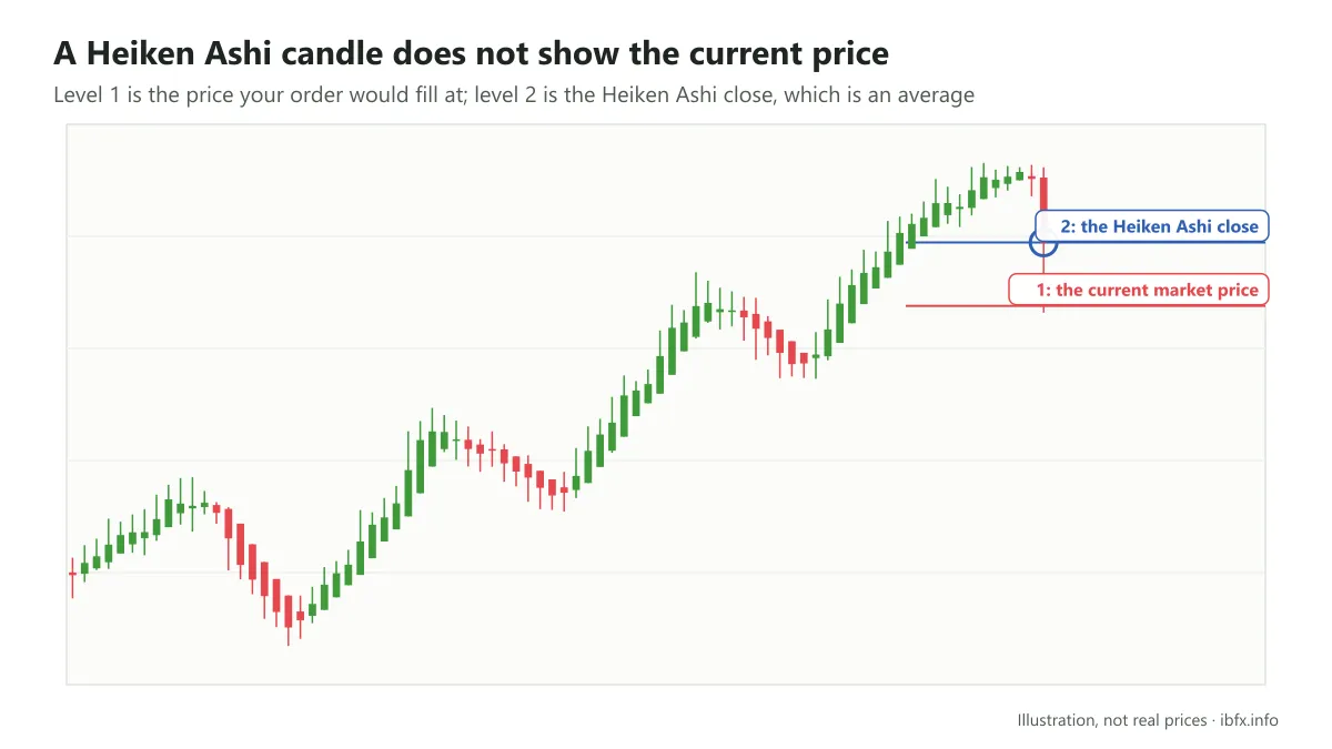
Looking at the Heiken Ashi chart in TradingView makes this easier to see. Area number 1 is the current price of the market, while area number 2 holds the prices that go with the movement of the Heiken Ashi candle.
What the Heiken Ashi chart is used for in trading
Because the averaging smooths it out, the Heiken Ashi chart is at its best in spotting the trend and giving signals that point to it. On top of that, the Heiken Ashi chart also makes some price patterns easier to recognize.
Heiken Ashi for spotting the trend of the market
You can spot the trend of the market by eye from the structure of the move. In an uptrend price makes higher highs and higher lows; the other way round, in a downtrend price makes lower highs and lower lows.
With the Heiken Ashi chart, spotting the trend is easier thanks to the color and the wicks of the candles that build the trend, something harder to see on the Japanese candlestick chart.
In an uptrend the green (rising) candles turn up in overwhelming numbers and very evenly, with very few red candles, and sometimes none at all if the uptrend is a strong one. The green candles that build the uptrend usually have a long upper wick and a very short lower wick, or no wick at all.
For example: the Heiken Ashi chart and the Japanese candlestick chart of EUR/USD on the D1 timeframe, over the same period.
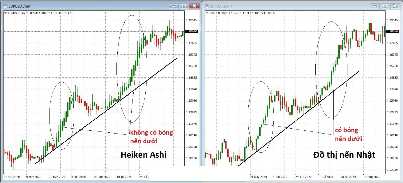
The screenshot shows the Vietnamese interface; the buttons and labels sit in the same places in the English version.
The trendline is drawn the same way on both charts, at the same slope.
On the Heiken Ashi chart there are fewer red candles, and they only turn up in the pullbacks, as a run of red candles one after another. On the Japanese candlestick chart, the other way round, red candles turn up more often, mixed into the rallies. And in the pullbacks, green candles still turn up among the red ones.
Looking straight at the Heiken Ashi chart, going by color, we can see the main trend and the pullbacks of the market at once.
On the Heiken Ashi chart, the whole run of green candles in a strong uptrend has no lower wick, while on ordinary Japanese candles most of them do.
In a downtrend the red (falling) candles turn up in overwhelming numbers and evenly, with very few green candles, and sometimes none at all in a strong downtrend. The red candles that build the downtrend have a long lower wick and a very short upper wick, or none at all.
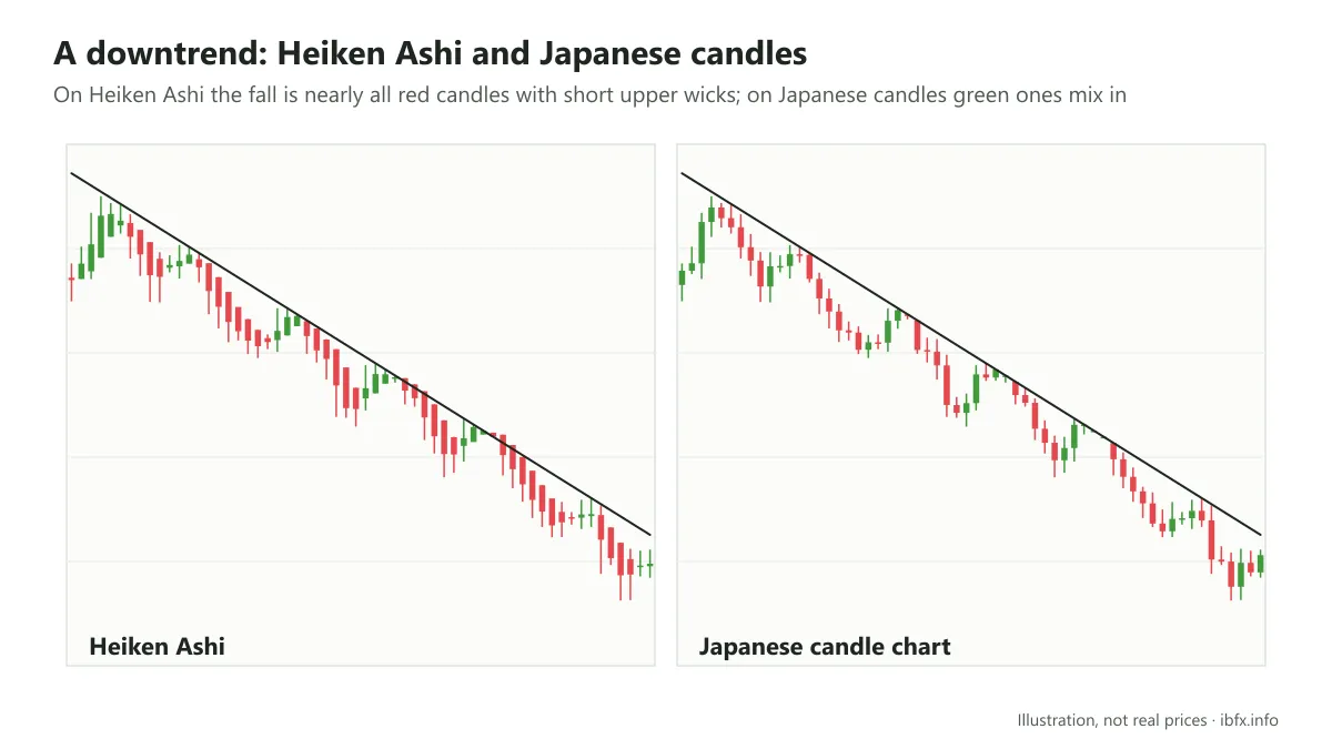
On the Heiken Ashi chart, in a downtrend, green candles only turn up in the rallies of the market, while in the falls the red candles are overwhelming. On the Japanese candlestick chart, the other way round, green candles are mixed into the main falls and red candles turn up in the rallies too.
The run of red Heiken Ashi candles in a downtrend has no upper wick either, or only a very short one.
Heiken Ashi as a signal about where the trend is going
- The buy signal
When a whole run of green (rising) Heiken Ashi candles appears (at least 3 in a row) with a long body, a long upper wick and a short lower wick or no wick at all, it shows the uptrend is strong. Plenty of traders treat this as a signal to look for a Buy, but because Heiken Ashi lags, the signal can appear when price has already run a long way and a pullback is close.
- The sell signal
When a whole run of red (falling) Heiken Ashi candles appears (at least 3 in a row) with a long body, a long lower wick and a short upper wick or no wick at all, it shows the downtrend is strong. Plenty of traders treat this as a signal to look for a Sell, with the same note about the lag as above.
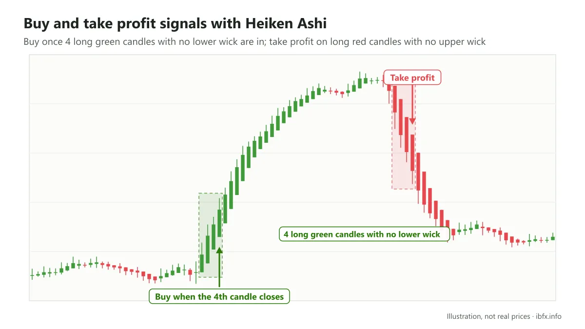
After 4 green candles in a row with a long body and no lower wick appeared, the market rose strongly right afterwards. You could buy when the 4th candle ended.
After it had risen for a while, 4 red candles in a row appeared with a long body and no upper wick, which is the signal for you to leave the position and close the trade to take profit. And the market turned down right afterwards.
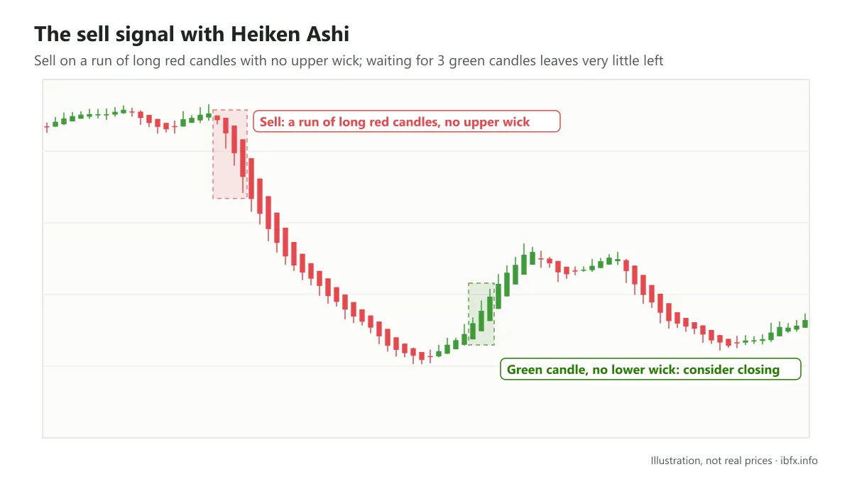
In the same way, a whole run of red Heiken Ashi candles with a long body and no upper wick gives you the signal to enter a Sell.
In this situation, however, if you wait for all 3 green candles with a long body and no lower wick to appear one after another before you close, you will have no profit left, or even a loss, because the gap between the entry and the exit is very small.
That is why, when you pick a Heiken Ashi signal to take profit on, you should close as soon as a green candle with a long body and no lower wick appears (for a Sell), and close a Buy as soon as a red candle with a long body and no upper wick appears. You can add a reversal signal from an indicator or from a candlestick pattern on the Japanese candlestick chart.
- Heiken Ashi as a signal that a reversal may be coming
The Heiken Ashi candle that gives this signal is the Doji. A Heiken Ashi Doji looks just like an ordinary Japanese Doji: a candle with a short body (near enough a straight line) and an upper and a lower wick.
A Heiken Ashi Doji appearing within a trend shows the market is hesitating. There are 2 possibilities: either the market is taking a pause before the side in control throws its weight behind the current trend with more force 🡪 the trend carries on, or the strength of the side in control is fading, which gives the other side a chance to step into the market 🡪 the trend reverses.
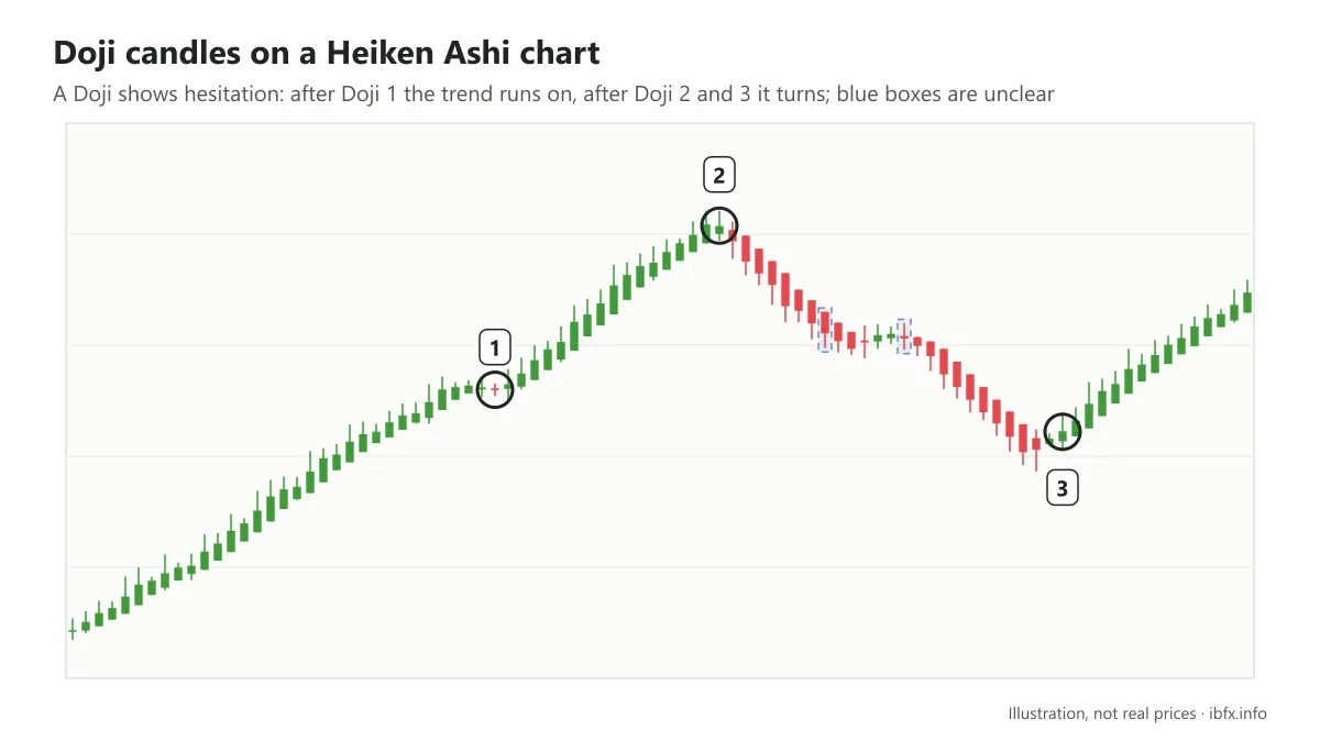
In the picture above, after Doji 1 appeared the trend carried on, while Doji 2 and 3 appeared and turned the trend around instead.
The Doji candles marked with a blue box give no clear result. In practice, the Heiken Ashi Doji appears often, and not every appearance gives a strong trading signal. That is why the Doji should only be treated as a sign of hesitation that may lead to a reversal; to trade it better you should add several other analysis tools, to guard against the risk in those situations where the Doji points to the trend carrying on, or where the Doji is only noise.
Heiken Ashi for recognizing some price patterns better
Thanks to features such as candles that look denser and more tightly packed, few lower wicks in an uptrend or few upper wicks in a downtrend, and the smoothing, the Heiken Ashi candlestick chart helps you recognize price patterns better, particularly the price patterns defined by trendlines. Among them, the Triangle and the Wedge are 2 price patterns that are usually easy to make out on a Heiken Ashi chart.
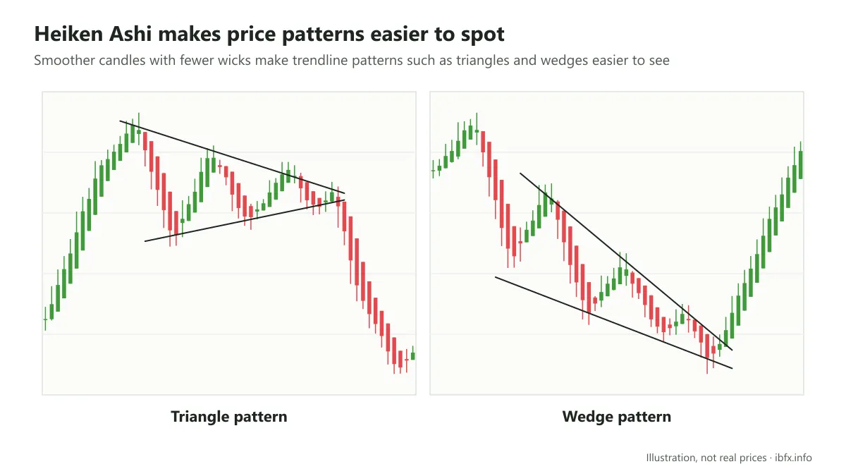
Recognizing these 2 patterns gets simpler, so what matters is that you work out a solid trading plan. These 2 patterns are also fairly alike, but there are still features that make an important difference between them. You need to keep those features in mind, as well as how to trade each pattern.
Trading these 2 patterns on the Heiken Ashi candlestick chart works the same way as on the Japanese candlestick chart, and you can read the articles below.
See also:
What the Heiken Ashi chart is good and bad at
Working out what the Heiken Ashi chart is good and bad at will help you make the right call about which situations to use this indicator in, and when to use Heiken Ashi instead of the ordinary Japanese candle.
What the Heiken Ashi chart is good at
- The smoothness of Heiken Ashi makes the trend easier to spot and cuts down the noisy signals that weigh on the mind of an investor or a trader in the face of short-term swings.
- The way the candles are colored within a trend also makes the trend easier to spot.
- It can be used on many different timeframes, just like the Japanese candlestick chart.
What the Heiken Ashi candlestick chart is bad at
- It does not show the current price of the market, so it is not used to place orders.
- It is simply an indicator, so it cannot bring out everything a price chart can.
- It depends on the price data of the previous session, so the signals the Heiken Ashi chart gives off come later than those of the Japanese candlestick chart.
- The nature of the Heiken Ashi candle means you cannot apply as many trading plans built on reversal or continuation candlestick patterns as you can with the Japanese candle. That is because most candlestick patterns are built out of the features of the Japanese candle.
- The signals Heiken Ashi gives about where the trend is going do not work well for taking profit.
- Because the signals lag behind the Japanese candlestick chart, reading the trend on small timeframes such as M1 and M5 does not work well.
- It is not used much, because it is less common.
In closing
Even though it is not as widely used as many other indicators, the Heiken Ashi chart is quite useful for seeing the trend plainly and filtering out some of the noise. In exchange, its signal is slower than the Japanese candle and it does not tell you the real price, so it tends to be used alongside the Japanese candlestick chart rather than as a full replacement for it.
For anyone who likes to trade with the trend, Heiken Ashi is a tool worth trying.
As a new trader, trend-following plans are usually easier to get to grips with, but they still carry risk, above all when the market moves sideways. If you take to Heiken Ashi, try the tool on a demo account for long enough before you bring it into real trading.