On this page
One way of trading that we always want to point you toward, new traders, people who do not yet have much experience in the market, to use in your own strategies is trading with the trend.
Why does this matter?
Trading with the trend is a great deal easier than fighting it or trading reversals. If you can read the trend and walk along with it like a friend, you already have an edge over trading against it, though you still need to manage risk.
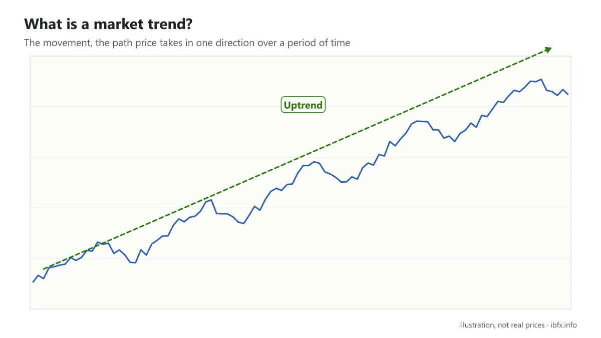
In forex trading, reading the trend lets you move in the same direction as the big money in the market (what Wyckoff called the “composite man”), instead of standing on the other side.
If the trend matters that much, do you really understand it yet? What is a trend? What does the structure of a trend look like? How do you identify a trend? If you are not sure, do not skip this article.
What is a trend?
A trend, or market trend, is the movement, the path prices take in one particular direction over some period of time.
In economics we often come across words that describe the state of a trend, such as growth, stability and recession. Growth is used when an economy is heading up; stability means there is not much movement, there are ups and downs but they turn around some average value; and recession is used when an economy is heading down. That is the trend of an economy.
In the same way, any asset also has a trend, and the market trend of an asset likewise exists in 3 different states:
An uptrend is a period in which the price of the asset moves upward.
A downtrend is a period in which the price of the asset moves downward.
A sideways trend is when price moves up and down within a certain range.
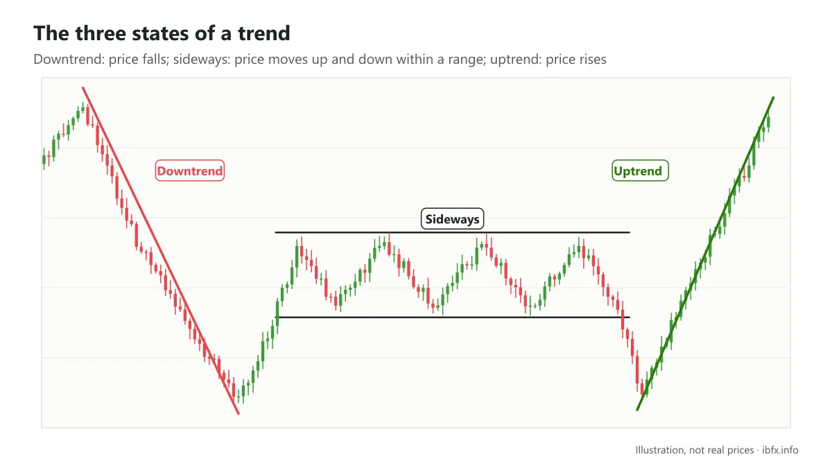
When the current trend ends, the market starts a new one. The most important part of reading trends is working out when the current trend ends and what the next one will be.
The structure of a trend
Every trend has a certain structure, and the trend only ends when that structure is broken.
- Uptrend structure: price makes each high above the last and each low above the last.
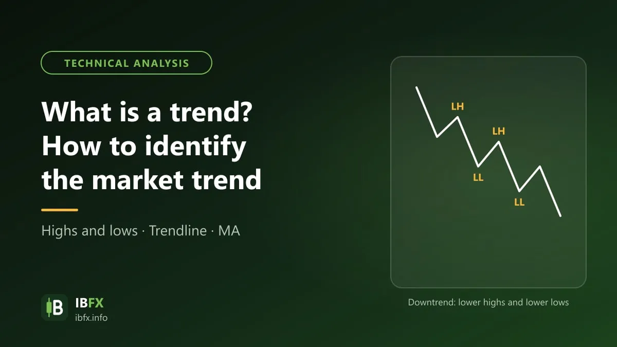
- Downtrend structure: price makes each high below the last and each low below the last.
- Sideways structure: price makes each high equal or close to the last, and each low equal or close to the last.
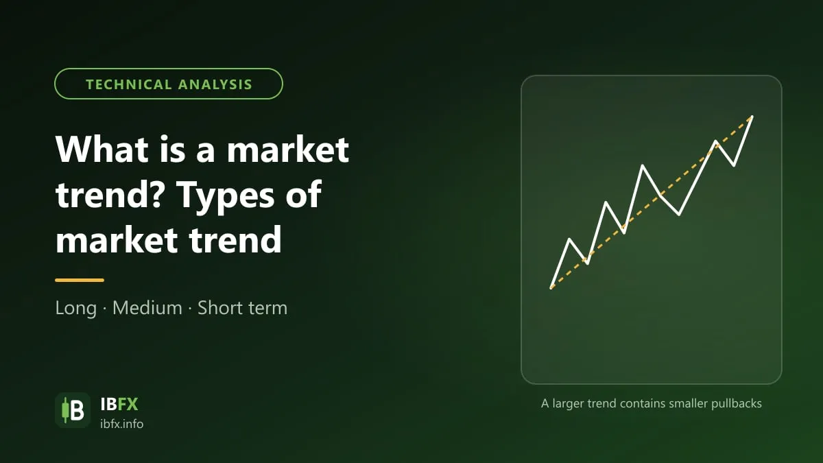
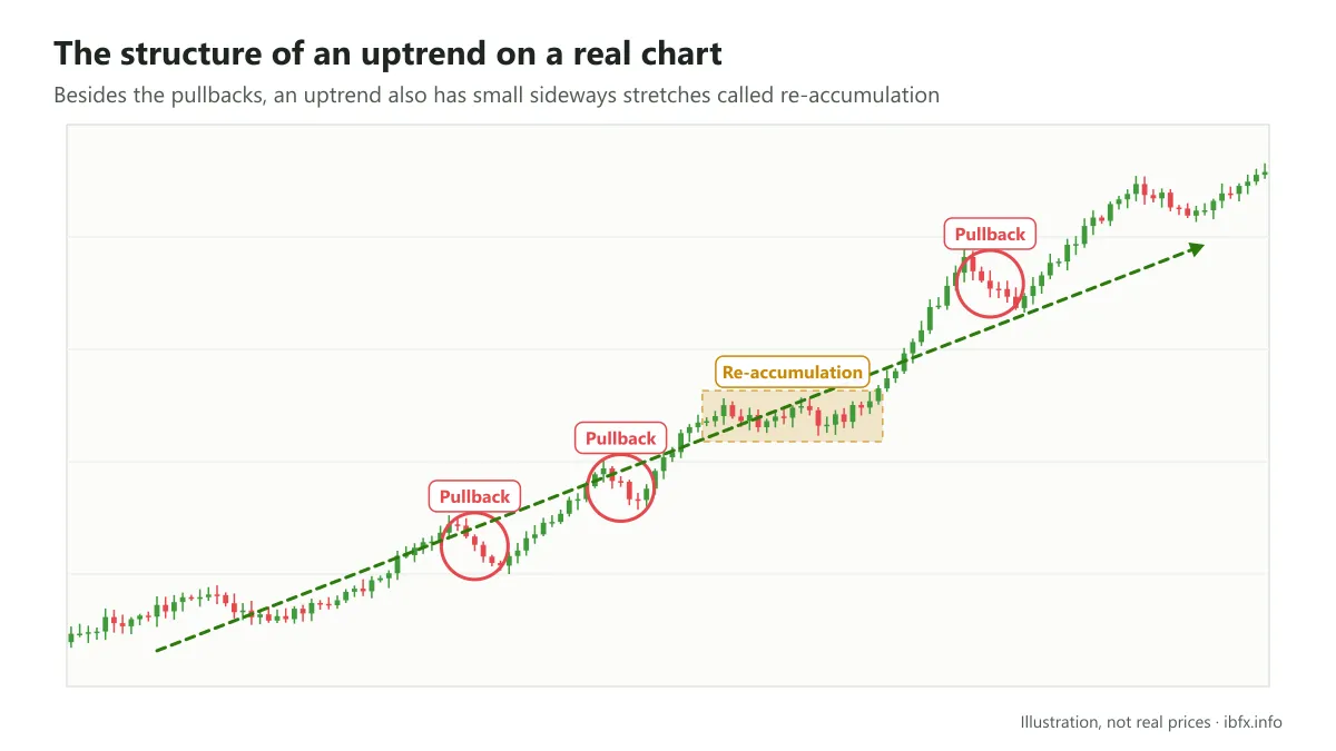
When the market is in an uptrend, price does not go up all the time; there are stretches in which the market pulls back. In the same way, in a downtrend price does not have to go down all the time; there are moments when the market rallies.
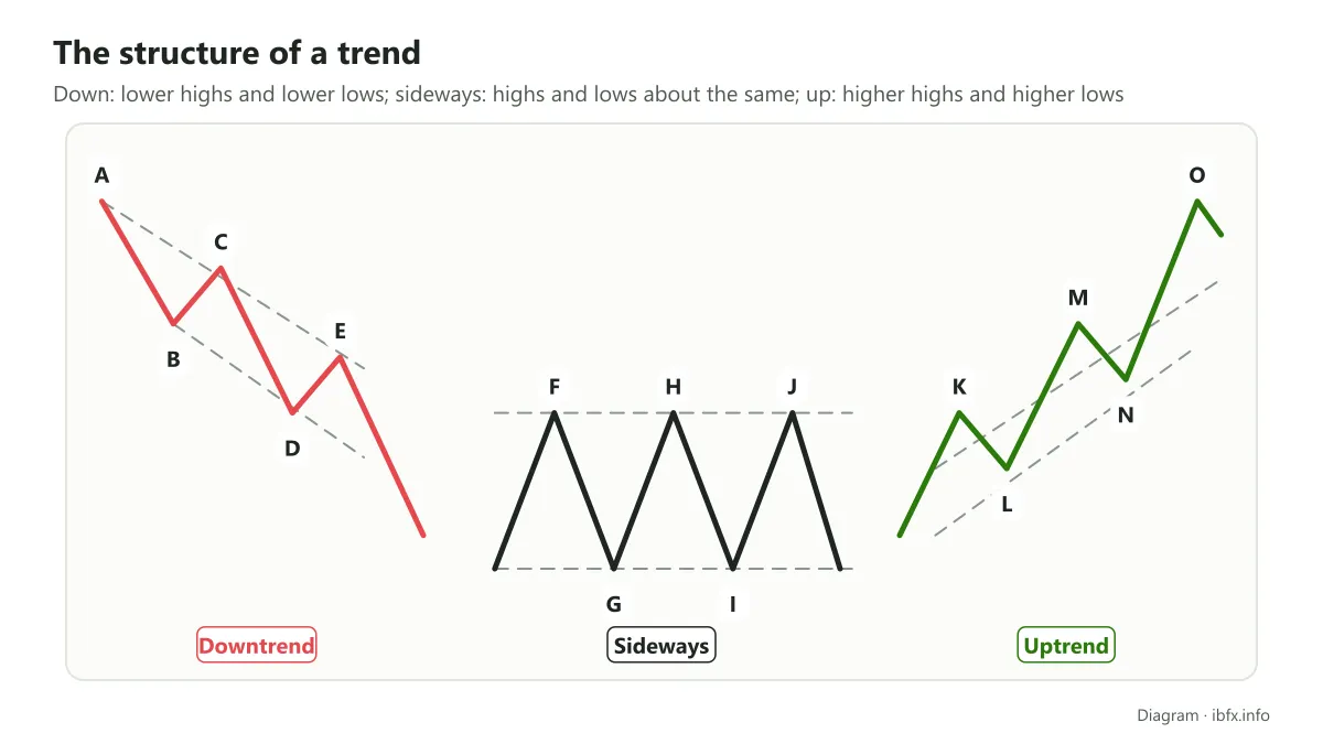
In the downtrend: price makes the highs C and E below the high A in turn, and the low D below the low B. The legs BC and DE are the stretches in which the market rallies, also called a temporary recovery, but these small waves only last a short while before the main trend carries on.
In the sideways trend: price makes the highs H and J equal to the high F, and the low I equal to the low G.
In the uptrend: price makes the highs M and O above the high K in turn, and the low N above the low L. The legs KL and MN are the stretches in which the market pulls back temporarily. Again, these waves only last a short while.
The trend structures above are the most basic ones, though; in practice the structure of a trend also exists in many very different variations.
In an uptrend or a downtrend, besides the pullbacks and the rallies the market also has small sideways stretches, called re-accumulation in an uptrend and redistribution in a downtrend. In a sideways trend, besides the constant up and down waves the market can also have short sideways stretches inside a range smaller than the price range of the main sideways trend.
The stages of a trend
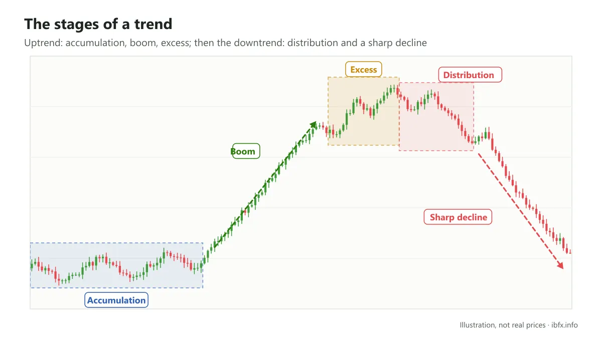
In Dow theory, an uptrend or a downtrend has 3 stages: from the moment the trend starts to form, to the moment it gains strength, and finally the climax of the trend. Understanding the stages of a trend helps you weigh up when to join the market and when to stand aside, even though in practice the line between the stages is usually only clear in hindsight.
The 3 stages of an uptrend are: accumulation, boom and excess. The 3 stages of a downtrend are: distribution, the sharp decline and despair.
The 3 stages of an uptrend
- The accumulation stage
This is the stage in which an uptrend begins. The accumulation stage also often shows up at the end of the previous downtrend. At this point the well informed investors (usually the large institutions) take the view that price has fallen deep enough and start buying gradually to accumulate the asset, while most of the market is still pessimistic.
At first trading volume is low because investors are still hesitant; once price starts climbing to higher levels, it encourages more buying, volume rises and price rises. During this accumulation stage the market has pullbacks, but it still meets the condition that each new low is above the old one.
- The boom stage
Once price leaves the accumulation zone, the market moves into the boom stage (Dow theory calls it the public participation phase). Good news and good figures gradually appear, trend followers and retail investors join in one after another, and price is pushed higher still.
This is usually the longest stage of an uptrend and also the one with the clearest upward momentum. Traders often hold longer term positions looking for a profit during this stage.
- The excess climax stage
This is the final stage of the uptrend, when price has risen too far after a long boom. During the excess stage the investors who bought early start selling to take profit (distribution), while many others are still keen to buy in the high price area. Buying pressure gradually weakens, a sign that the uptrend may be about to end.
After the excess stage ends, the market starts moving into the distribution stage, then the sharp decline and despair (the 3 stages of a downtrend). You can work out how these 3 stages play out for yourself.
How to identify the market trend
Identifying the market trend from the structure of the trend
We will take a specific example so that it is easier for you to picture how the trend is identified from this structure.
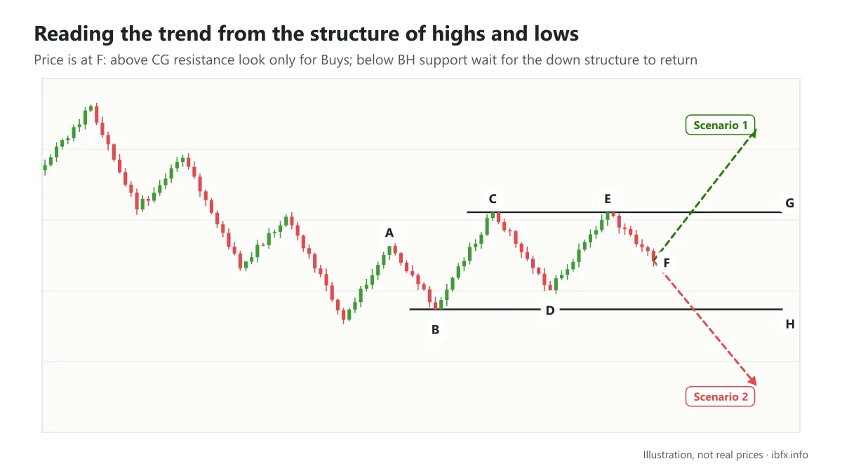
Right now price is at point F. Our job is to set out the scenarios that could happen and the trading plan for each one.
Step 1: Analyze the past trend
Before the stretch in which price made the high A and the low B, the market was in a downtrend. The structure of that downtrend is very clear: price made lower highs and lower lows.
- At point A, price is still carrying on the downtrend, because the high A is still below the previous high.
- At point B, price makes the low B above the previous low, but not by much, a sign that the sellers are running out of breath for the moment; to say the downtrend structure is already broken seems a little early, though.
- At point C, right after that, price makes a new high, the high C, above the high A, and the downtrend structure is officially broken.
- At point D, price makes a new low above the low B; together with the high C being above the high A, the stretch from A to D meets the structure of an uptrend, and this is the accumulation stage of that new uptrend.
- At point E, price makes a new high equal to the one just before it. That is not too unusual, because during the accumulation stage of an uptrend price often moves sideways; or the market may be forming a sideways trend after the downtrend ends, instead of the uptrend first expected. This sideways trend has a price range bounded by the support line through point B and the resistance line through the 2 points C and E.
Step 2: Work out the possible scenarios and the plan for each one
At point F (right now) there are 3 possible scenarios:
- Scenario 1: price clears the CG resistance and heads up, the market switches to an uptrend structure, and this is the moment the boom stage of the uptrend begins. In this scenario the trades that run with the trend are Buy trades — you still need a confirming signal and a stop loss, because a break can turn out to be a false one.
- Scenario 2: price breaks the BH support and heads down. In this scenario we should not rush to conclude that the market is carrying on the downtrend; better to stand aside and wait for a few more signals. If, after the support is broken, price rallies and then keeps falling, the downtrend structure is re-established, and taking a Sell then is safer.
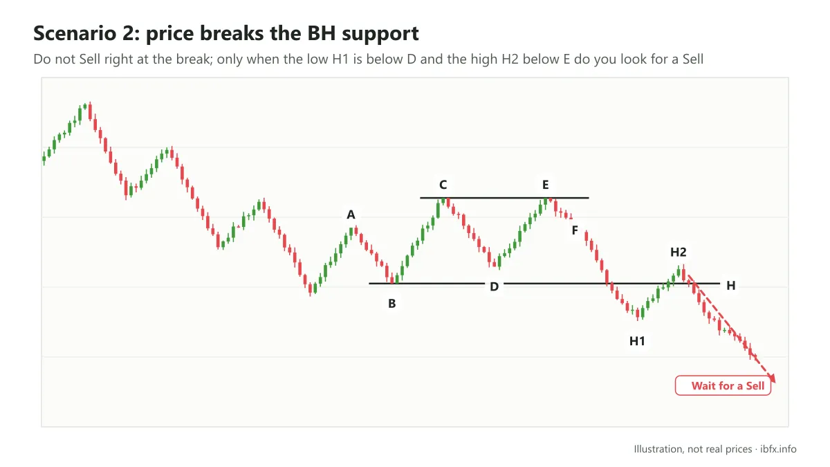
If, after the support is broken, price makes the low H1 (below the low D) and the high H2 (below the high E), as in the chart above, then we can wait for a chance to take Sell trades.
- Scenario 3: price swings inside the range of the BC leg. The market is then carrying on the accumulation stage of the uptrend, and you can wait for a reversal signal to take a Buy; or the market may carry on in the sideways trend, and you can trade at the support and resistance zones of that sideways trend.
For each scenario you need to use other technical analysis tools, such as a trendline, indicators, reversal candlestick patterns and price action, to pin down the exact entry and stop loss.
Identifying the market trend with indicators and other technical tools
For the way of identifying the market trend from the trend structure above, the only tool you need is a bare price chart. That is the simplest and least cluttered way, but with it the exact entry point is hard to find, even once you have settled on the direction to trade.
Among the technical analysis tools, some both help you identify the market trend and suggest entry points. The trendline, the price channel, the moving average (MA) and the ADX indicator are the ones many traders use.
Trendline and price channel
The trendline is the most basic tool for identifying the trend of the market. A rising trendline runs through the lows and a falling trendline runs through the highs of a trend. When price closes well beyond the trendline, the trend may be breaking, but you need more confirmation, because false breaks happen fairly often.
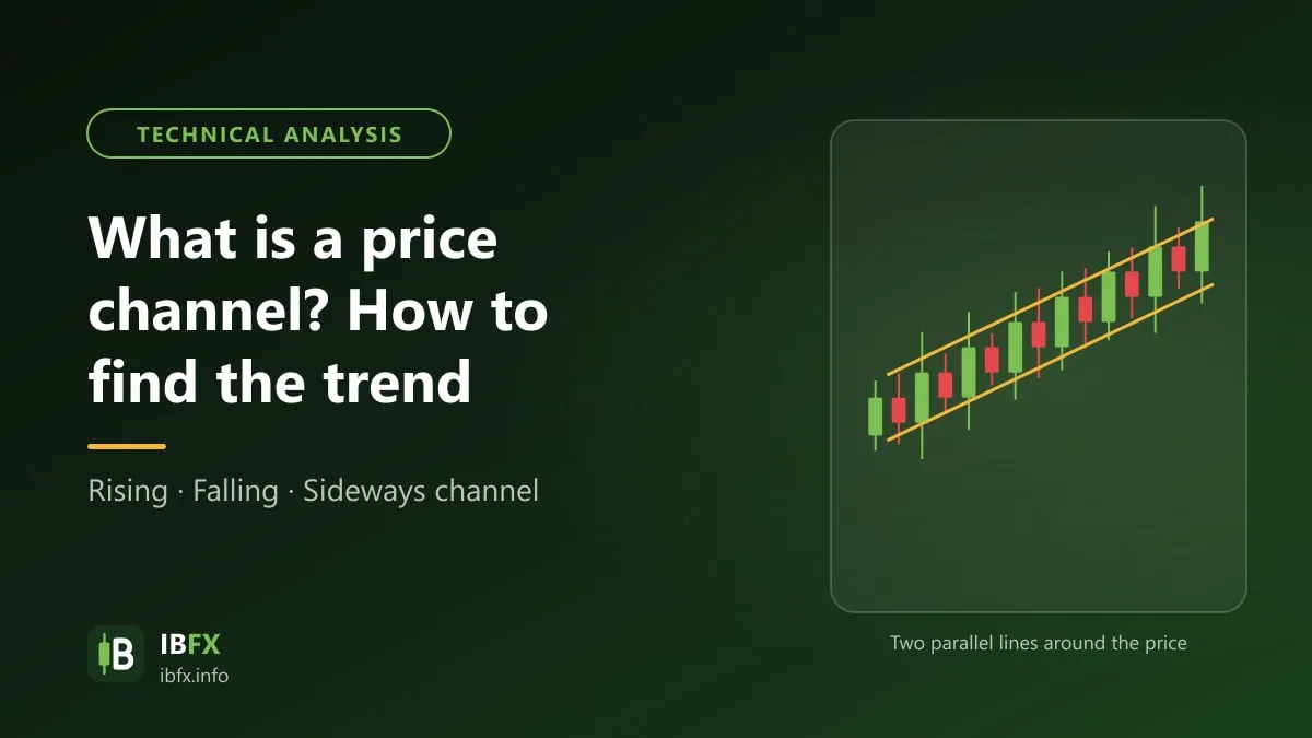
By drawing one more line parallel to the trendline, through the highs (for an uptrend) or the lows (for a downtrend), we get the price channel of the trend. The channel shows the range price usually swings in during that trend. When price breaks below a rising channel (or above a falling one), the current trend may be ending; when price breaks in the direction of the trend, that is usually a sign the trend is speeding up.
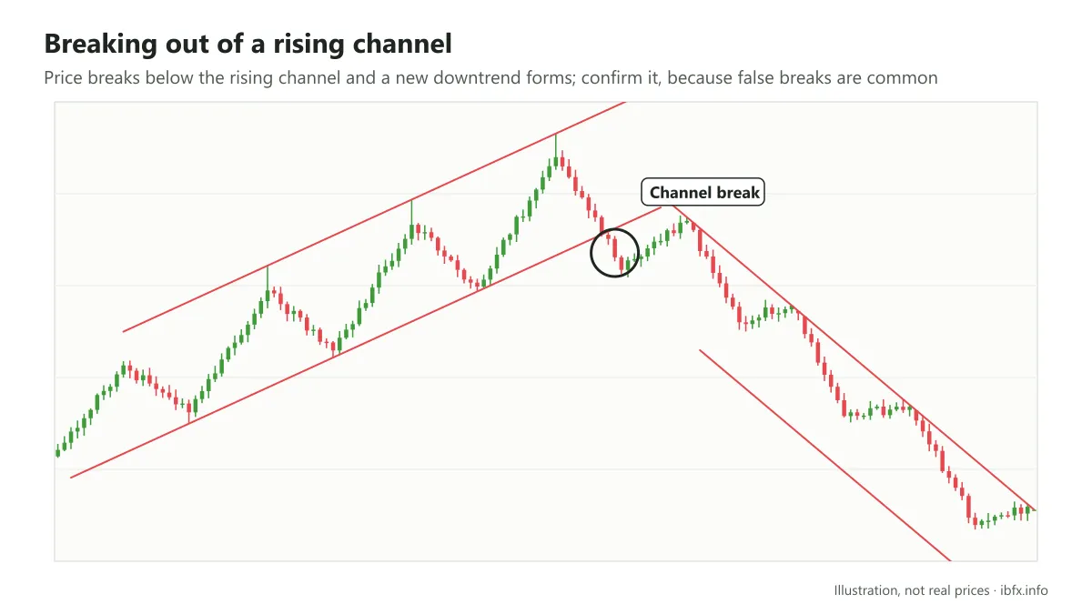
In the chart above, after the channel break the market formed a new downtrend.
To learn how to draw and trade the trendline and the price channel, see the following articles:
- What is a trendline? How to draw it and trade with it
- What is a price channel? How to identify the trend with a price channel
The moving average (MA)
The MA is one of the most widely used trend indicators today (read more: What is the EMA?). Instead of watching price move up and down all over the place, the MA moves more smoothly and helps you see the trend more clearly.
By watching where price sits relative to the MA, or where the MA lines sit relative to each other, you can identify the current trend of the market; and the way of using the MA that suits beginners best is trading with the trend.
The MA also acts as the support and resistance levels of the trend: you can trade with the trend at those price zones, or trade the reversal signal when those levels are broken. For new traders who have not built up enough experience, though, do not risk the reversal strategy.
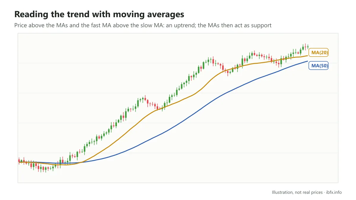
To learn how to identify the trend and trade with the MA, see the article: What is the MA? How to trade with the MA.
The ADX indicator
The ADX is a technical indicator that measures the strength of a trend. It has 2 parts: the ADX line, with values from 0 to 100, which tells you whether the trend is strong or weak (not its direction), and the 2 lines +DI/-DI, which tell you the direction of the trend.
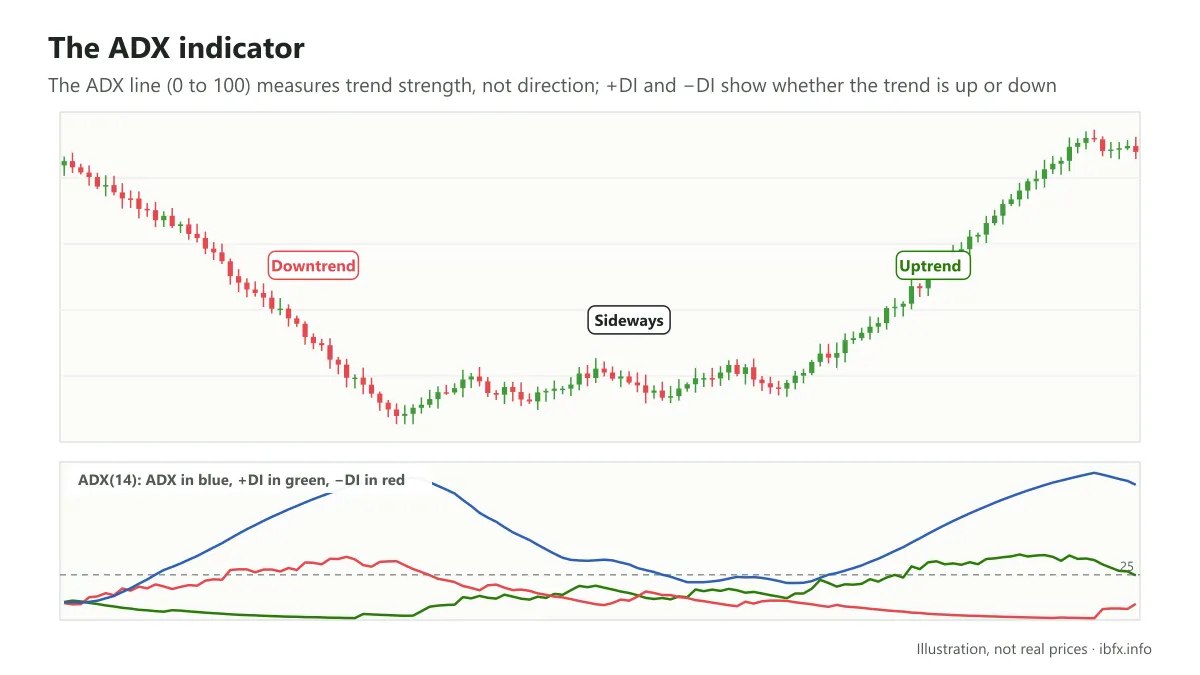
The trend really does matter a great deal in forex, and reading it well is an important foundation for a trader in this market, alongside money management and discipline. That is where the saying “the trend is your friend” comes from, but understanding this friend is not easy at all, rather like reading a person’s mind.
With what we have shared above, we hope you will put it to good use in your day to day trading. It is not a holy grail, nor is it some lofty technique; it is only the most basic knowledge, which can help you get a firmer grip on the market trend and go further in understanding this friend. Practice identifying the trend on a demo account before you trade for real.