On this page
Every day a trader has to answer questions such as: should I Buy or Sell this currency pair, how far should I wait before I enter, is gold trending up or down today? One of the ground-level skills for answering those questions is reading a Japanese candlestick chart.
For an experienced trader, reading a candlestick chart is familiar work, but for a beginner it really is a puzzle. This article will walk you through the basic steps for analyzing a candlestick chart in a systematic way. Note that no way of reading a chart lets you predict price exactly; the aim is to trade on some sort of basis and with a risk management plan.
Note: before you read this article, you should learn how a Japanese candlestick is built and the basic candlestick patterns:
What reading a Japanese candlestick chart means
Analyzing a chart, or reading the candles, means watching price action to weigh up the trend and the strength of the trend, and from there to find a sensible entry, stop loss and take profit.
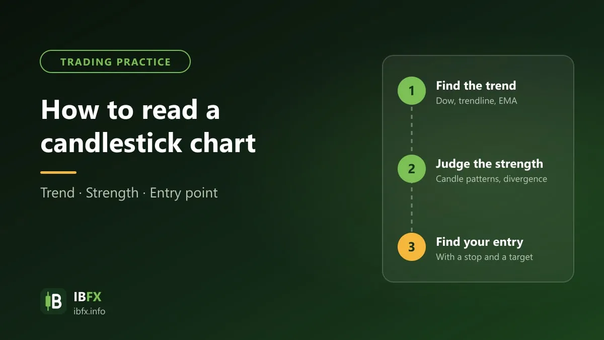
Dull as it may be for a lot of people, analyzing the chart is work a trader of the technical school needs to do regularly. We split the process into 3 basic steps so that beginners find it easier to practice:
- Step 1: Read the trend of price
- Step 2: Weigh up whether that trend is strong or weak
- Step 3: Look for the entry, the stop loss and the take profit.
In our view, reading the trend of price is the most important step. Many traders skip it, draw a single trendline and go straight to looking for an entry. Sometimes that still works, but it comes with a fair amount of risk. So, before you take the pulse of the market, look at which trend the pair you want to trade is in.
If you are a new trader, have a look at these articles as well:
- What is forex? The basics you need to know about forex trading
- What trading forex means. A guide for beginners
- What is TradingView? A detailed guide to using TradingView.
Without knowing how to read the trend, reading a candlestick chart is hard
One of the classic principles of Dow theory is that “the averages discount everything”. Which means that every piece of information, every expectation, every fear and every stretch of optimism in the market, including the effect of great events such as the Covid-19 pandemic in 2020, shows up in price. A Japanese candlestick chart uses only two colors to show a bullish and a bearish candle, and yet it holds a great deal of information about the mood of the market.
Because price reflects everything, reading the trend helps a trader understand which side the market is leaning towards and trade along with that direction, rather than mixing Buys and Sells together. For example, when the current trend is up, a trader waits for price to pull back down to look for a chance to buy; when the trend is down, a trader waits for price to rally to look for a chance to sell.
Under Dow theory the primary trend, which is the long-term trend, usually lasts a year or more rather than turning around on the spot. Trading with the trend raises the odds of winning, but it does not mean every trade wins.
Bitcoin at the end of 2017, or the Vietnamese stock market in 2000–2001, are examples of very strong uptrends. Both then fell deeply, though: Bitcoin lost more than 80% of its value against its December 2017 peak, while the VN-Index lost about 3/4 of its value from the 2001 peak to 2003. Whoever bought at the end of the trend took a very heavy loss, so reading the trend always has to go hand in hand with risk management.
That is why traders have a saying: trade with the trend and you live, trade against it and you die. Reading the trend clearly is the first step when you analyze a chart. So how do you read the trend?
The basic steps for reading a Japanese candlestick chart
Step 1: Read the trend on the candlestick chart
A few simple ways to read the trend:
- Dow theory
- The trendline
- The EMA moving average
- The price channel
Using Dow theory to read the trend
For all the criticism of it, there is no denying that many of the technical analysis methods used today grew out of Dow theory, so this is the ground every trader ought to have firm under their feet. See also: What is Dow theory?
Under Dow, the market has 3 levels of trend: the primary trend, which is the main, long-term one; the secondary trend, which is made up of the corrections; and the minor trend, the short-lived swings. When analyzing a chart, traders usually look only at the primary and the secondary trend. And when the market moves sideways with no clear trend, the wisest course is usually to stand aside and wait for a clear trend before trading.
By the rules of Dow theory, a trader should give priority to trading with the primary trend, which can be an uptrend or a downtrend.
In an uptrend, price keeps clearing the old highs, while the corrections do not break below the low before them. In other words, to establish an uptrend under Dow, the pair has to make each high above the one before (HH — Higher High) and each low above the one before (HL — Higher Low).
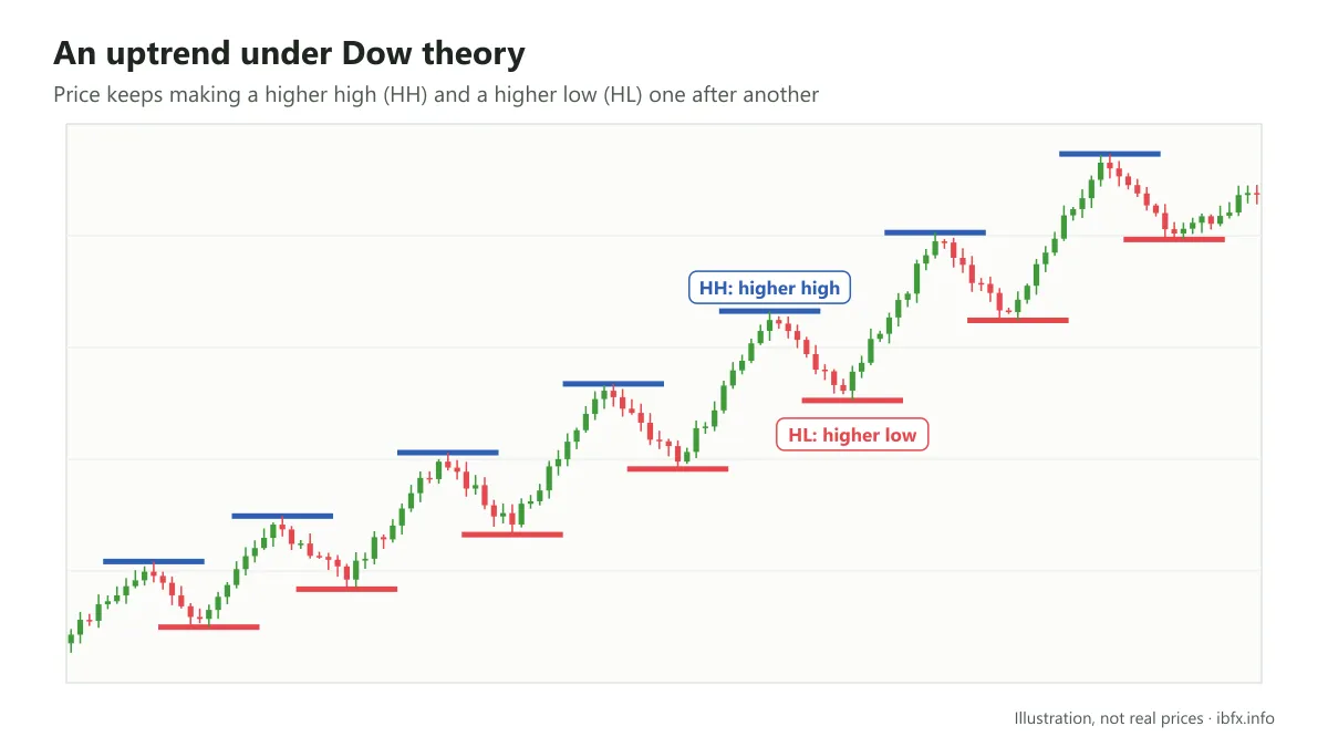
As in the chart above, price makes a higher low and a higher high one after another all the way through a long uptrend.
In the same way, in a downtrend, price makes each high below the one before (LH — Lower High) and each low below the one before (LL — Lower Low).
When an uptrend ends, price can no longer hold on to higher highs and higher lows. Once price starts making lower highs and lower lows, the primary trend turns into a downtrend, as in the picture below:
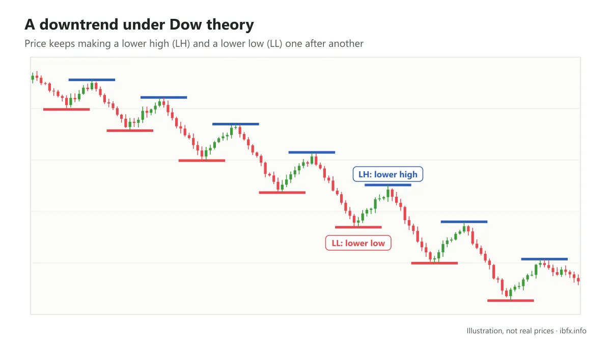
So Dow theory helps you read the trend fairly objectively and give priority to trading with the primary trend to hold risk down.
Support and resistance
Before we talk about the trendline, we need to understand support and resistance levels.
Support and resistance are the zones where buyers and sellers fight it out. Price does not move in a straight line but in waves, and at the highs and the lows of those waves important price zones form, where the market decides whether the trend carries on or turns around.
A support level is where sellers try to push price lower but fail, because buying is stronger, which sends price back up.
A resistance level is where buyers try to push price higher but fail, because selling is stronger, which sends price back down.
When an important support or resistance level breaks, its role usually flips over: old resistance can become new support, and the other way round. A break in the direction of the current trend is usually a signal that the trend carries on; while a break below an important support zone in an uptrend (or above an important resistance zone in a downtrend) can be a sign that the trend is weakening or turning around. Note that false breaks are fairly common.
For an uptrend to hold, price needs to keep making higher support levels. In a downtrend, price keeps making lower resistance levels.
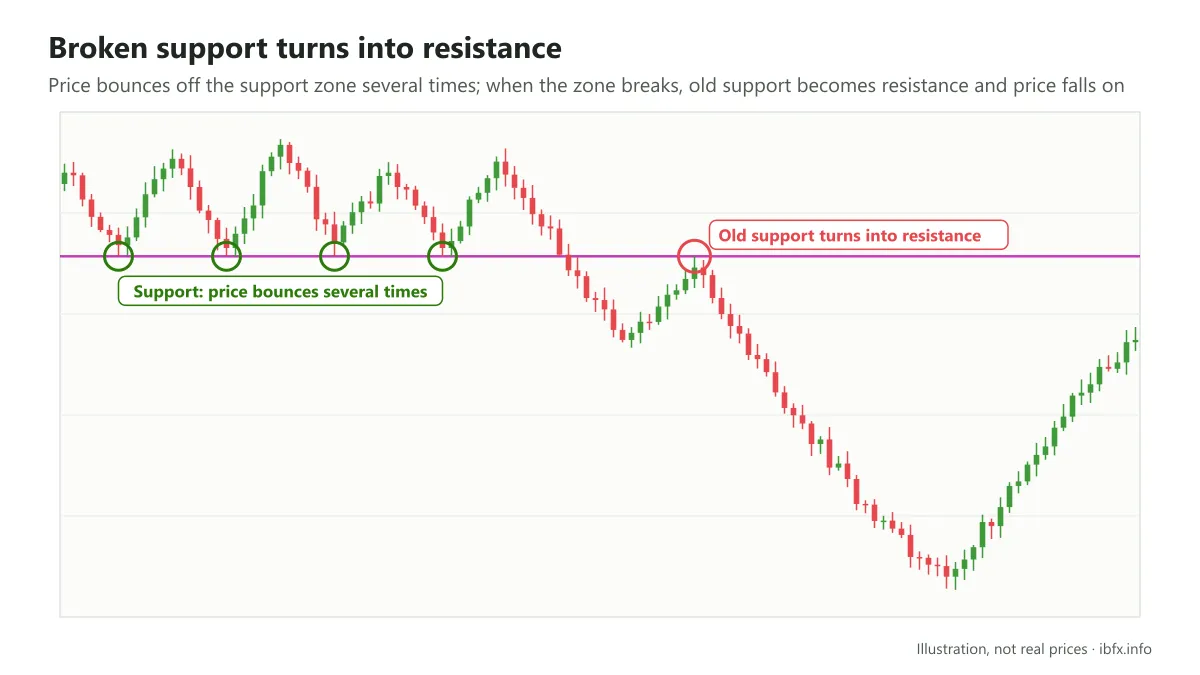
In the picture above, price falls back to the support zone and bounces several times. After that, though, this support zone breaks, the old support turns into resistance, and price falls hard over the months that follow.
See also: Support and resistance: what they are and how to identify them
Using a trendline to read the trend
In investing there is a saying, “the trend is your friend”. The trendline is one of the common tools that help a trader read the trend.
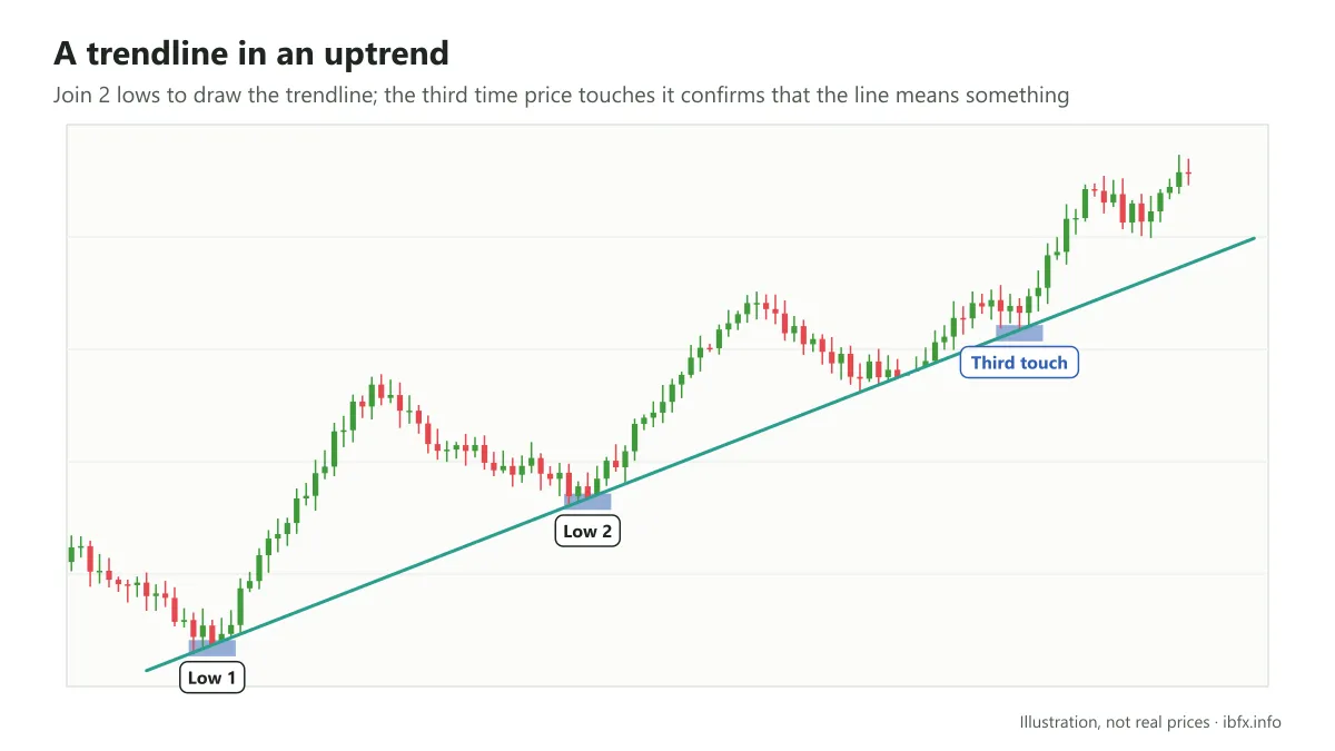
Drawing a trendline depends a fair amount on each trader’s experience and eye. The simplest way is to join up 2 main lows (in an uptrend) or 2 main highs (in a downtrend).
In an uptrend, the trendline is the line joining the lows. You need at least 2 lows to draw a trendline, but you usually need a third touch to confirm that the line means something.
In a downtrend, the trendline is the line joining the highs. In the same way, you need at least 2 highs to draw it and a third touch to confirm it.
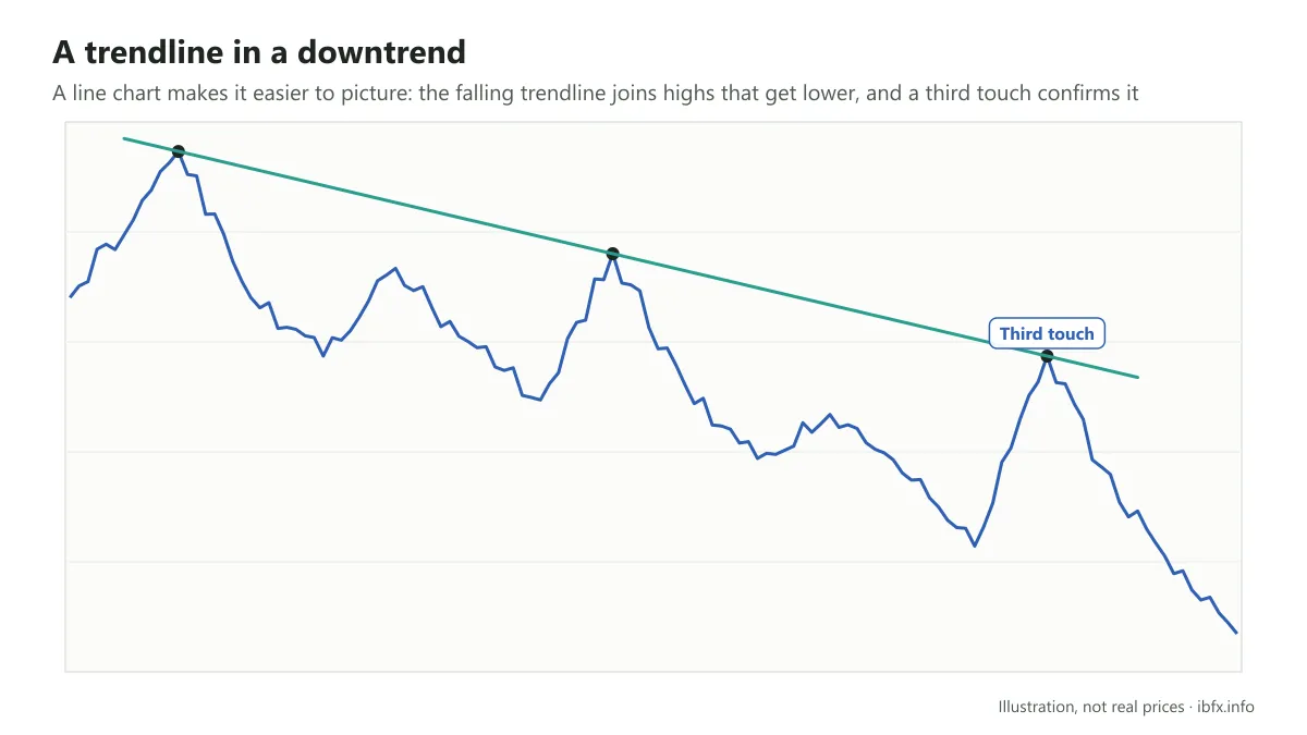
The example above uses a line chart so that you can picture it more easily: price runs in waves, but because this is a downtrend the waves get lower and lower.
Inside a long-term trend there are always short-term rises and falls the other way, which are called corrections. Reading the trend clearly helps you stay calmer through these corrections; for example, when you are selling EUR/USD with a downtrend and price rallies a little, you do not panic. Even so, you still have to pick a sensible entry and always respect the stop loss you set.
See also: What is a trendline? How to draw one correctly
Using the EMA to read the trend
MA (Moving Average) is a moving average, an indicator that smooths out the swings in price so the trend is easier to make out. Two kinds are common: the SMA (simple moving average) and the EMA (exponential moving average).
The SMA is the average of the closes over a set number of sessions — the SMA 40, for example, is the average price of the last 40 sessions, each session carrying the same weight. The EMA is worked out over a number of sessions too but puts more weight on the recent ones, so it reacts to price faster than the SMA and lags less. That is why many traders prefer the EMA. See also: What is the EMA? How to use the exponential moving average
Because it moves with price, a moving average usually acts as a moving support or resistance zone, unlike the horizontal support and resistance zones. The shorter the period (such as the EMA 10) the closer the line hugs price, but the more noisy signals it gives; the longer the period (such as the EMA 200) the less noise, but the more lag. So traders usually use at least two lines, one with a short period and one with a long period.
The basic way of reading the trend: price above the moving average (with the average sloping up) is usually taken as an uptrend; price below it (with the average sloping down) is usually taken as a downtrend. When the average runs flat and price keeps cutting back and forth across it, the market may be moving sideways and the signals are easily muddied. A moving average usually gives steadier signals on the larger timeframes such as H4 and D1.
An example of the EMA:
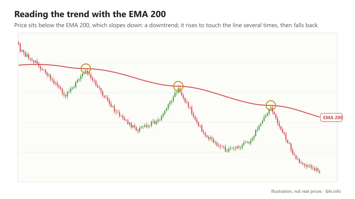
As you can see, price sits below the EMA 200 for most of the time over many months, and touches the EMA 200 several times before falling back.
Using a parallel price channel to read the trend
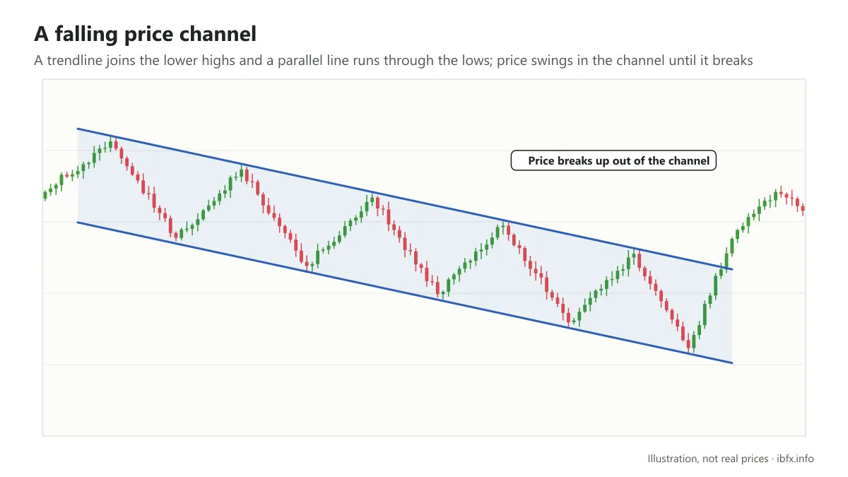
A price channel is made from a trendline and a line parallel to it.
In an uptrend, you draw the trendline joining the lows, then draw a parallel line through the highs, which gives you a channel pointing up.
In a downtrend, you draw the trendline joining the highs, then draw a parallel line through the lows, which gives you a channel pointing down. See also: What is a price channel?
Step 2: Weigh up how strong the trend is
Once you have read whether the primary trend is up or down, the next step is to weigh up whether that trend is still strong or is weakening, whether it is about to end or still carrying on. This helps you decide whether to join the market, take profit or stand aside.
Beginners very often enter at the end of a trend: only when the trend is already glaringly obvious on the chart, or even already fading, do they rush in to chase a buy or chase a sell, which ends up buying the top and selling the bottom.
To hold this down, you can use some of the following tools:
Elliott waves
Elliott wave theory has a lot in common with Dow theory in the way it looks at a trend. One impulse cycle is made of 5 waves: 3 waves that run with the trend, waves 1, 3 and 5, and 2 corrective waves, waves 2 and 4. By Elliott’s rules, wave 3 is never the shortest of the three waves 1, 3 and 5, and it is usually the strong one, the longest. This is the stage where many traders notice the trend and keep joining in, which carries price beyond the high of wave 1. By the time price is in wave 5, the trend has usually run a long stretch and the risk of a reversal is higher.
Counting waves is fairly subjective, and the same chart can be counted in several ways. See also: What are Elliott waves?
Using reversal candlestick patterns
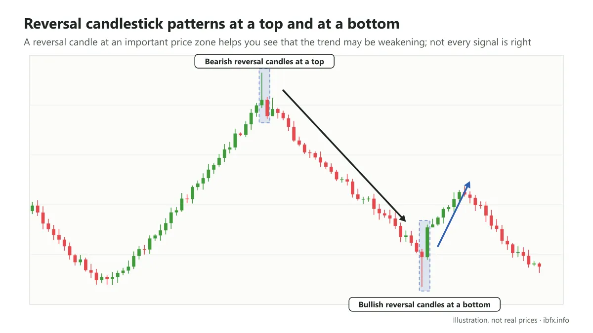
Once you have read the trend, you can watch for reversal candlestick patterns appearing at important price zones to spot when the trend may be weakening, and from there look for an entry or an exit. This is the way a great many traders go about it.
Reversal candlestick patterns are fairly easy to spot too, so if you are just starting out you should get these patterns firmly in hand first. Putting reversal candles together with a trendline, support and resistance or the EMA is a simple way of finding an entry or an exit, though not every signal is right.
We have a detailed article on reversal candlestick patterns, which you can read as well:
The important reversal candlestick patterns to know in forex
Using chart patterns
Chart patterns come in 2 main kinds: continuation patterns and reversal patterns. These patterns play an important part in technical analysis, and you should look into them once you have the candlestick patterns in hand.
Note that a reversal pattern only means something when there has been a clear trend before it (up or down), because there has to be a trend for anything to reverse; and a continuation pattern needs an existing trend to continue as well. That is one more reason why reading the trend matters so much.
No kind of pattern is always stronger than the others; how much a pattern can be relied on depends on the context, on where it shows up (whether it sits on an important support or resistance zone), on the timeframe, and on whether price breaks and confirms the pattern.
At the start you will find the patterns hard to spot, but after a while of practice recognizing them gets much easier. Below are the common patterns, with pictures of where to enter and where to exit.
Continuation patterns
- The Flag pattern
- The Pennant pattern
- The Wedge pattern; note that a wedge can be a continuation or a reversal pattern depending on the context. See also: Rising and falling wedge patterns
- The Rectangle pattern
- The Cup and Handle pattern, usually treated as a continuation pattern of an uptrend
Reversal patterns
- The head and shoulders pattern and its inverse
- The triple top and triple bottom patterns
- The double top and double bottom patterns
Besides those two groups, there are patterns that can break either way, such as the symmetrical triangle: whichever side price breaks, consider trading in that direction.
A worked example of a pattern:
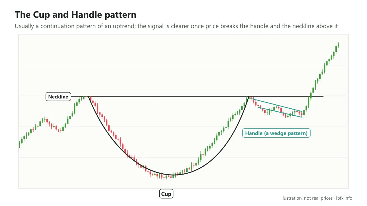
This is a Cup and Handle pattern on the daily timeframe (the handle also forms a wedge pattern). After breaking the side of the wedge and clearing the neckline above it, price rose hard.
Using momentum indicators such as RSI, MACD, Stochastic, CCI and so on
Once price has risen or fallen a long way, a trader always asks whether it can keep going. Besides the patterns above, you can use momentum indicators to measure how fast price is changing, to see whether the drive up or down is gathering or fading.
One outstanding use of momentum indicators such as RSI and MACD is spotting divergence. See also: What is divergence? The types of divergence in technical analysis
Bearish divergence happens when price makes a higher high (HH) but the indicator makes a lower high (LH).
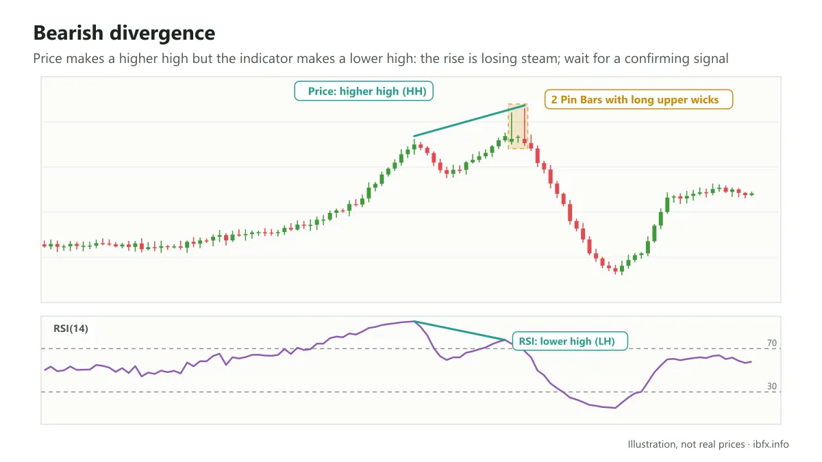
This shows that the drive up is fading, that buying is no longer as strong as it was, and that price may correct or reverse downward.
That is only a possibility, though, not a certainty. There are plenty of cases where divergence appears and price still clears the old high and carries on up, especially in a strong trend. So you should wait for one more confirming signal, such as a reversal candlestick pattern, before you place a trade.
In the picture above, divergence appears on price, and at the higher high on the daily timeframe price closes as 2 Pin Bars with long upper wicks, which shows buying being strongly rejected at the top zone. Together with the divergence, price then fell fairly hard.
In the same way, bullish divergence (which many traders call convergence) happens when price makes a lower low but the indicator makes a higher low, which shows that selling is fading.
Both kinds of divergence signal that the trend may reverse, but do not rush to Sell the moment you see bearish divergence or rush to Buy the moment you see bullish divergence; wait for more confirming factors.
There is also hidden divergence, which is usually treated as a signal that the trend carries on. To keep things simple for a beginner, you only need to understand that divergence is when price and the indicator head in two different directions.
You can use RSI, MACD, CCI or Stochastic to look for divergence. Each indicator has its own character, so read up on it carefully before you use it:
- What is the Stochastic indicator? How to trade Stochastic
- What is MACD? How to use the MACD indicator
- What is RSI? How to use the RSI indicator
Step 3: Find the entry, the stop loss and the take profit
Once you have read the trend and weighed up how strong it is, the next step is to find the entry, the stop loss and the take profit.
Nobody, not even a professional trader, can pin these points down exactly. The aim is to put them at places that rest on something and that keep the reward against the risk sensible.
Besides the tools above, such as support and resistance and the trendline, you can use Fibonacci to find an entry zone and a take profit. In forex the two most common Fibonacci tools are Fibonacci retracement, usually used to find the correction zone where you can enter with the trend, and Fibonacci extension, usually used to estimate a take profit target.
At bottom, the Fibonacci levels are potential support and resistance zones worked out by ratio, so you should combine them with other signals rather than use them on their own.
For the details on Fibonacci you can read further:
- What is the Fibonacci sequence?
- How to use Fibonacci retracement to find an entry
- How to use Fibonacci extension to take profit
With the chart patterns above, how to place the entry and the stop loss is set out in detail in each article about the pattern.
Summary
- Read the trend with Dow theory (the structure of highs and lows), a trendline, a moving average or a price channel.
- Weigh up how strong the trend is with candlestick patterns, chart patterns, Elliott waves and divergence on the momentum indicators.
- Find the entry when price corrects back to a support or resistance zone or the trendline, or when price breaks and confirms an important price zone, together with a candle signal.
- Put the stop loss behind the nearest support or resistance zone, or behind the signal candle, a sensible distance away (allowing for the spread and for volatility, going by the ATR indicator, for example), and avoid putting it so close that the trade is easily swept out.
- Take profit at the next support or resistance zones or at the Fibonacci levels, with a reward at least 2 times the risk (an R:R of about 1:2 or better).
Finally, work out your position size so that each trade risks only about 1–2% of your account, and practice reading charts on a demo account before you trade with real money. See also: What is a stop loss? How to set a stop loss in forex trading